GUBS Card Game Redesign
Redesign and localization project of the North American card game GUBS for the Brazilian public, seeking to improve usability, textual hierarchy, visual aspects, and the game's cultural suitability.

Game Inspiration
Narrates the author's personal motivation, having discovered the game in childhood and, due to language and access barriers, ended up reproducing it by hand.
Double Diamond Methodology and Localization
Explains the project's approaches.
Discover
Focuses on a critical analysis of the strengths and weaknesses of the original design and UX.
Define
Formulation of the project briefing based on the research.
Develop
Creation of visual prototypes and testing of new proposals.
Deliver
Finalization and application of usability tests.
About Localization
Highlights that localizing is not merely translating, but adapting visual, narrative (lore), and mechanical elements to generate an intuitive and culturally coherent experience.
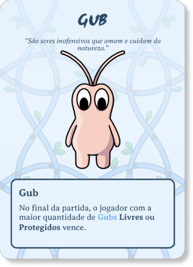
How the GUBS Game Works
- Objectives: The objective is to protect the largest number of "Gubs" creatures in matches lasting up to 20 minutes.
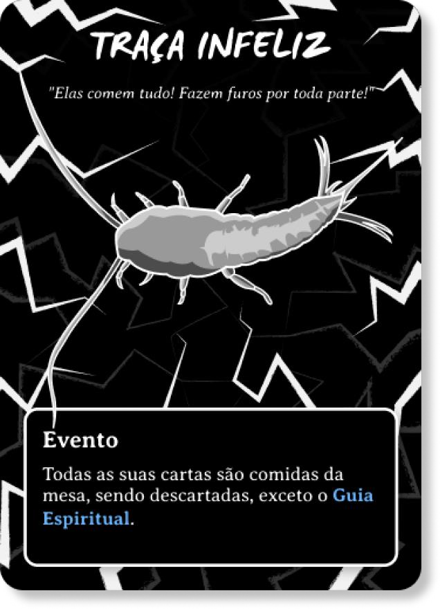
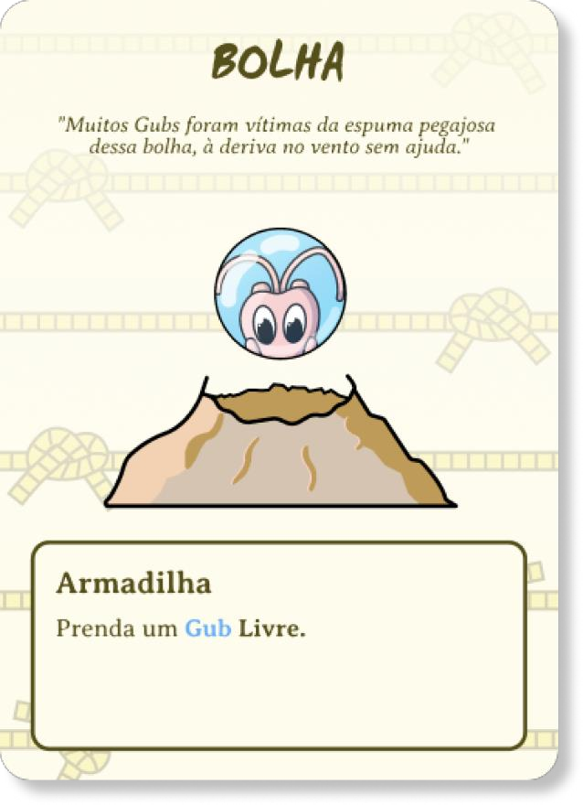
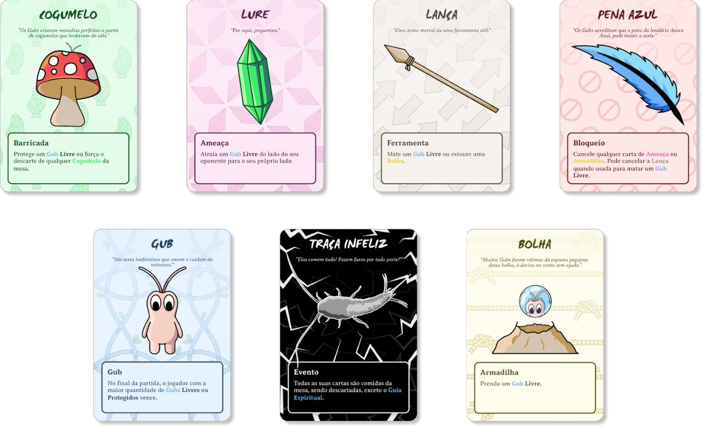
- Components: The deck has 70 cards divided into Gubs, Tools, Traps/Hazards, Barricades, and Events.
- Preparation: 3 cards are distributed to each player, and the cards with the letters G, U, and B are shuffled into the deck.
- Rules: Each turn involves drawing, playing, and discarding cards, keeping a maximum of 8 cards in hand.
- Victory: The match ends when the cards with the letters G, U, and B are drawn.
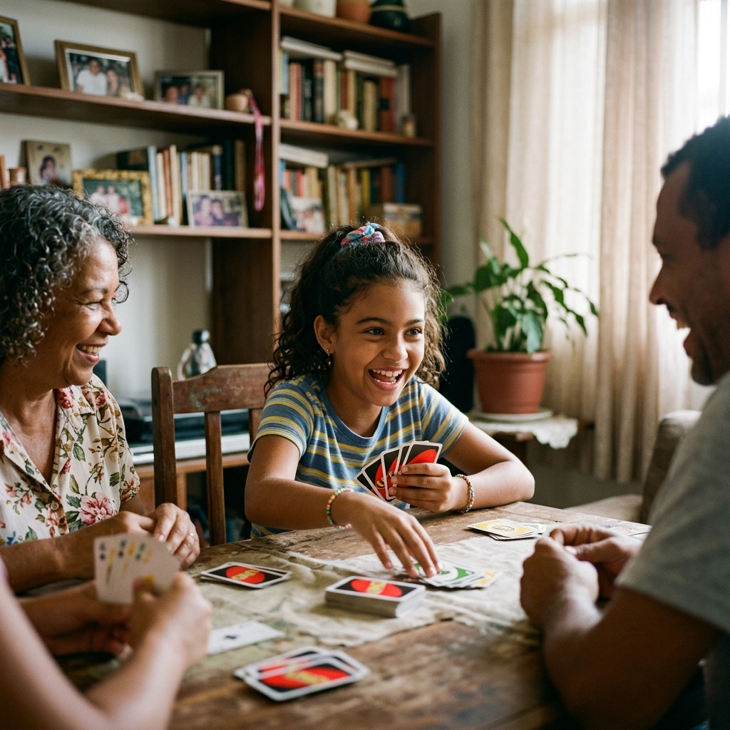
Target Audience Definition
In the US, it reaches young adults (18-35 years old) focused on strategy, as well as families. There is a strong distinction in behavior focused on family gatherings within the Brazilian market, which highly value intergenerational socialization. The target audience for the project was defined as Brazilian young adults and families (10 to 45 years old).
Five personas were created to guide decisions:
The 11-year-old child
Seeks simplicity and intuitive mechanics.

The teenager
Seeks fun with strong social connection and interaction.
The university student
Uses games as a quick way to destress between studies.
The adult enthusiast
Loves deep immersion and mechanical complexity.
The adult who dislikes games
Avoids complex manuals and looks for immediate playability.
Personas ensure a focus on the needs of all players.
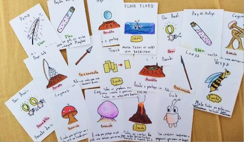
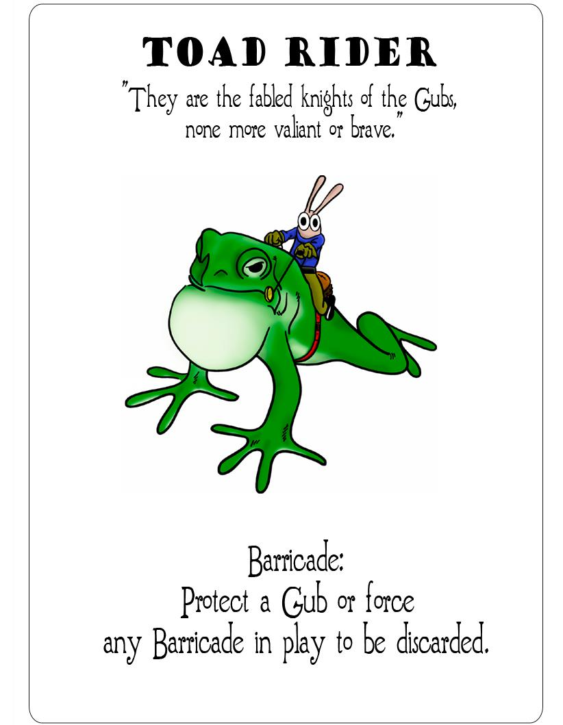
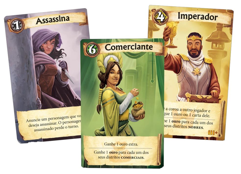
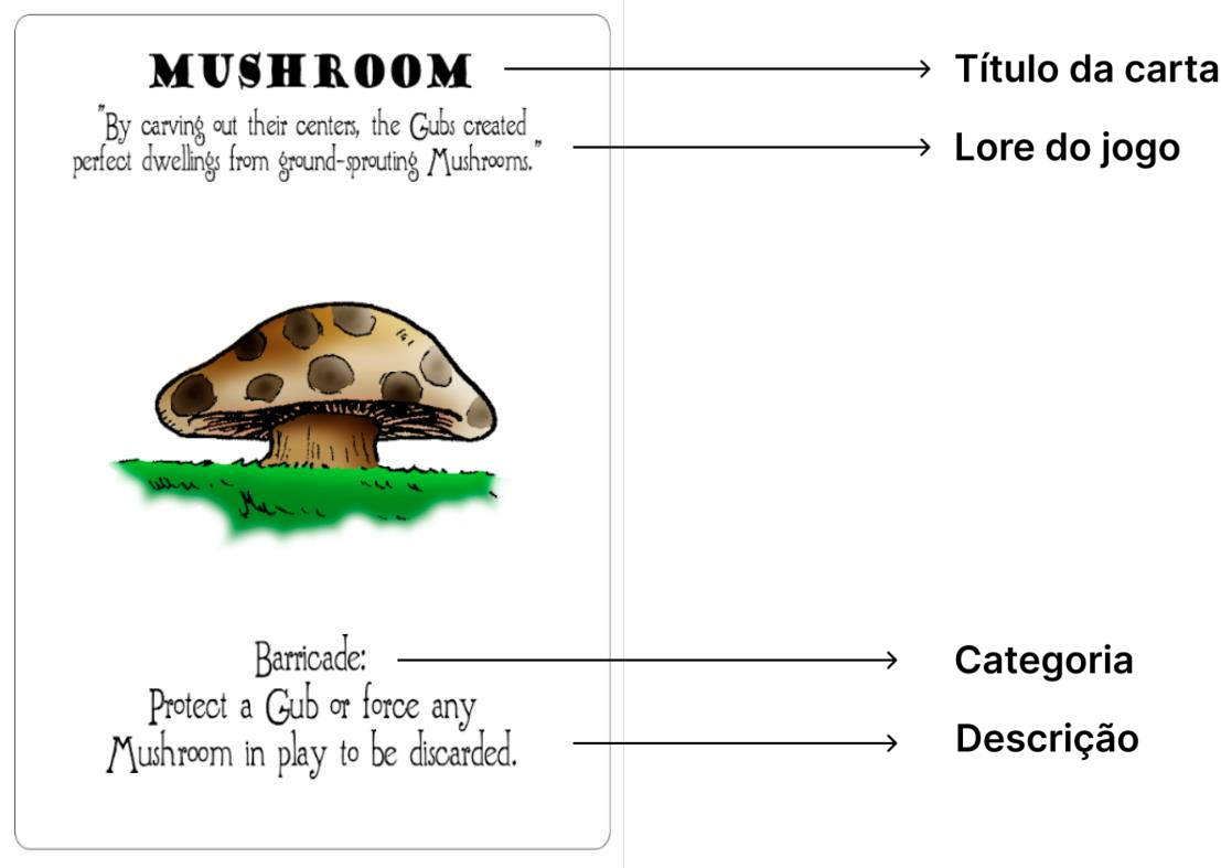
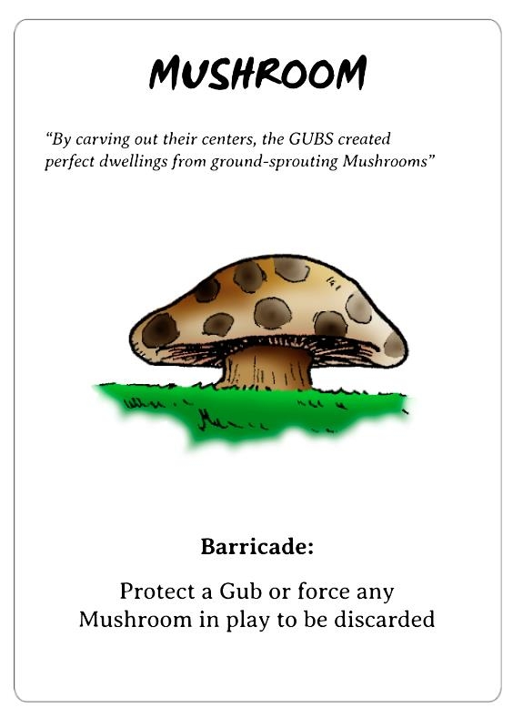
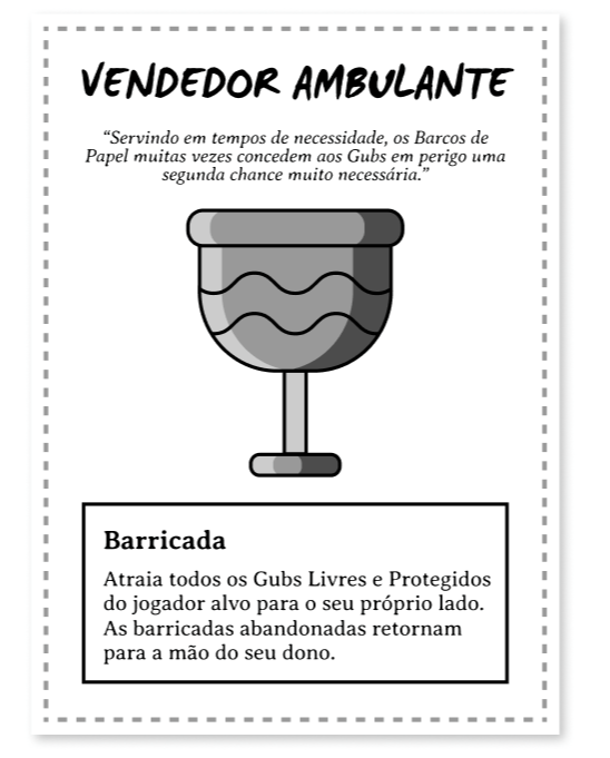
Card Structure and Content
Evaluates the original structure, composed of title, lore (narrative), image, category, and description. The texts within categories—Event, Barricade, Tool, Hazard, Gub type, Interrupt, Wild—were mapped and translated for analysis.
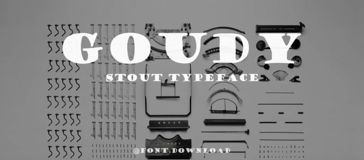
Card Design
Analyzes the original fonts, including the presentation image of the Goudy Stout Typeface (used in titles) and the Brandwyne font (used in categories, descriptions, and lore).

Iconography
Examines the aesthetic references of the drawings: Ligne Claire (Precise lines without shading), Rubber hose (Old, rounded cartoon style), and 2000s cartoons (Expressive lines).
Textual Hierarchy
Notes how fonts organize the card, resembling comic books.
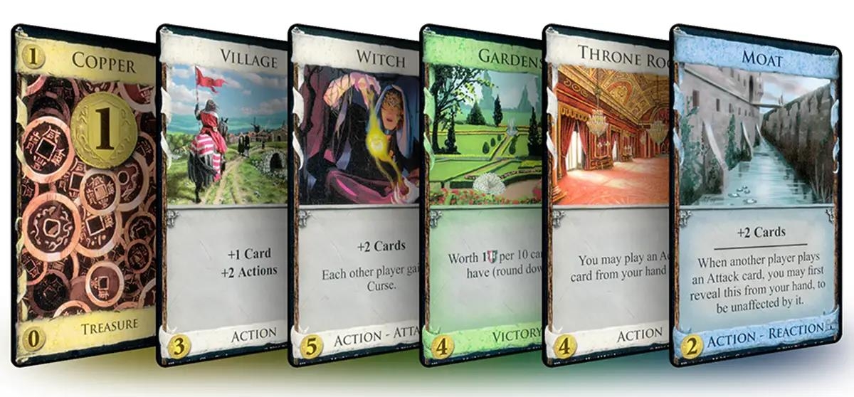
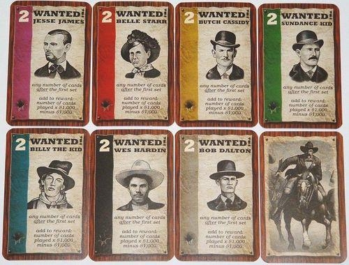
Analysis of Similar Games
Compares the hierarchy of GUBS with games from the same era: Dominion, Citadels, and Wyatt Earp.
Redesign Analysis & Research
Strengths
Includes its authentic narrative, the learning curve, visual differentiation by letter size, and illustration cohesion.
Weaknesses
Fails in hierarchy by using the same font and weight for different text blocks and ambiguous rule descriptions.
Points of Attention
The need to maintain the playful visual identity while adapting it for Brazil and improving the rules.
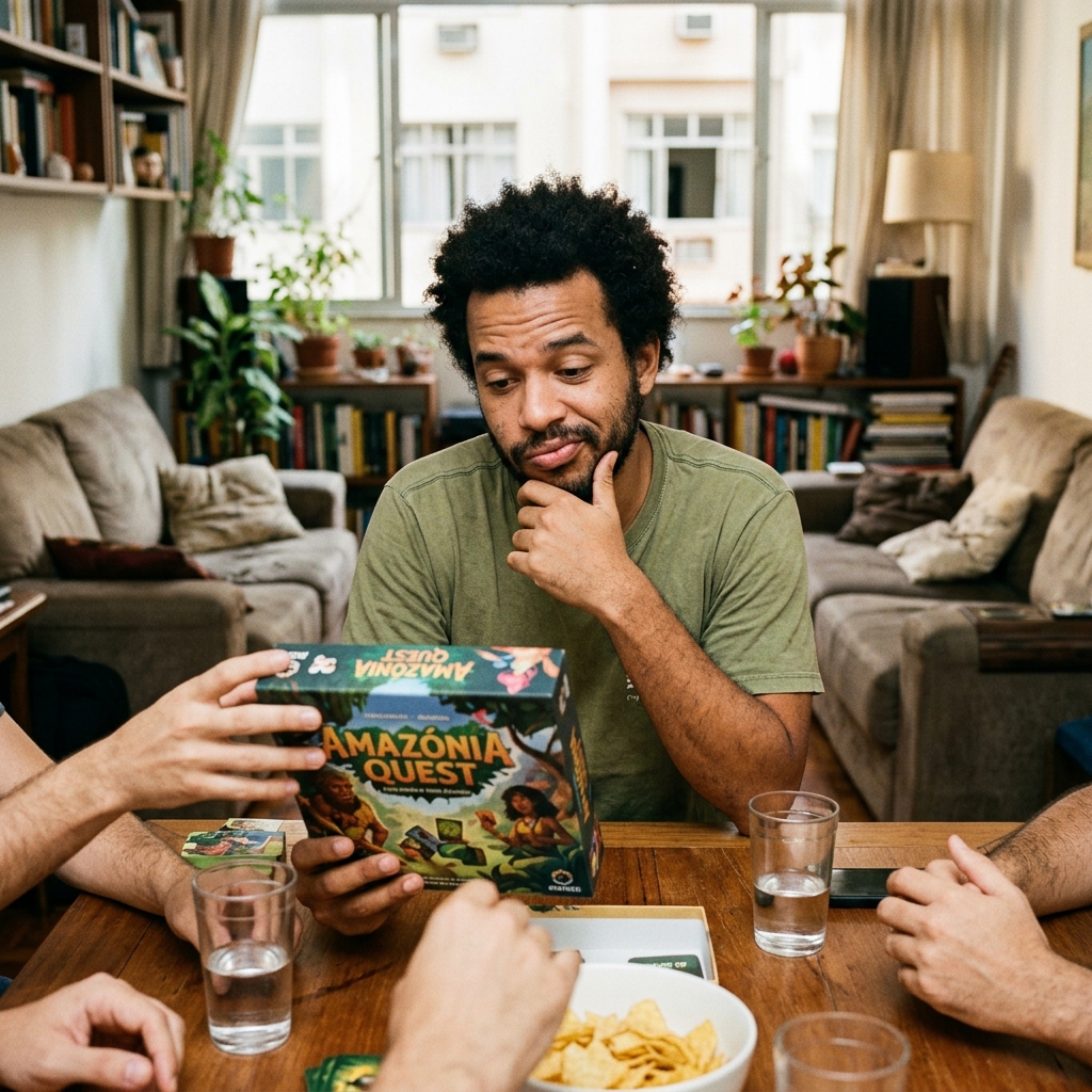
Original Game Experience Research
Real matches played with varied audiences revealed players faced language barriers due to the use of English. There was an easier time for players already familiar with RPGs, uncertainty regarding ambiguous rules, and the perception that the game can become repetitive.
Project Briefing
Briefing Overview
Objective
Modernize, generate visual clarity, and adapt thematically.
Deliverables
Visual redesign of the cards, manual, packaging, and text adaptation.
Success criteria
Validation via usability testing and cultural reception.
The briefing serves as the technical foundation for all design decisions, ensuring that the visual evolution stays aligned with both the original creator's intent and the new market requirements.
Card Production Methodology
Text Creation
Replacing literal translations with local adaptations. Just as the Pixar movie "Turning Red" was culturally adapted to Brazil, the "Velvet Moth" card became "Bruxa" (Witch), a reference to Brazilian moths.
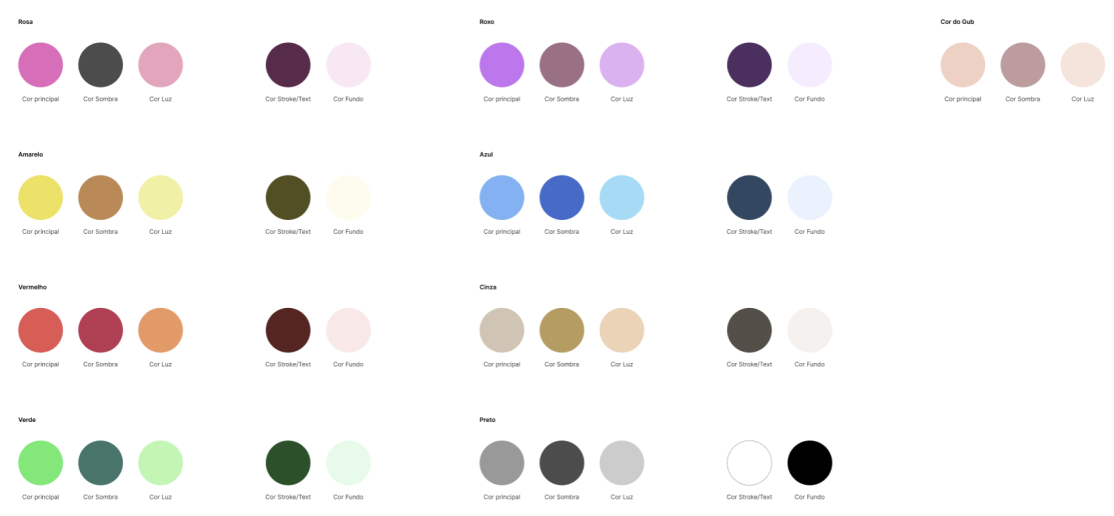
Design Fundamentals
Definition of color and font libraries in Figma.
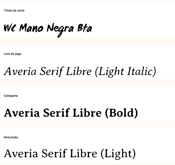
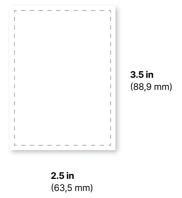
Card Templates
Layout adjustments to support the new typography and increase hierarchical clarity. Defined as Standard Poker Size.
Adjustments in visual proportions.
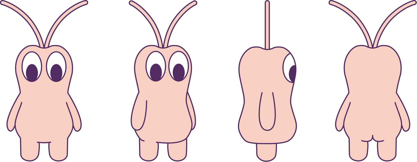
Gub Design
New character design.
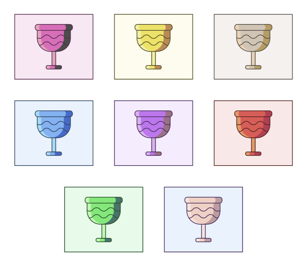
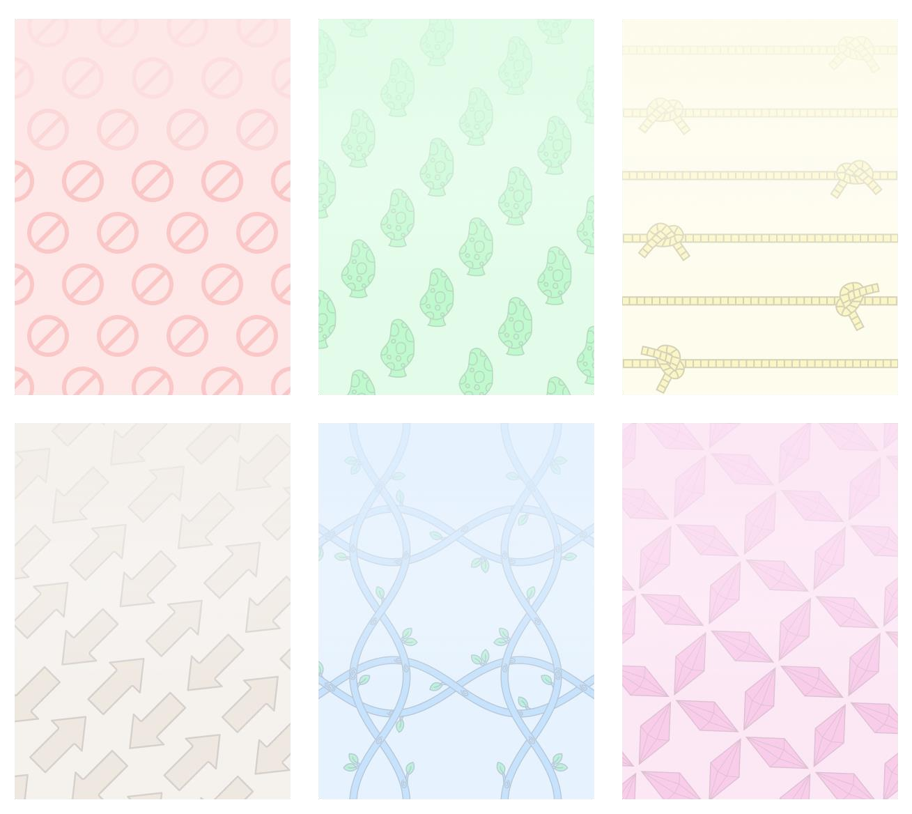
Visual structure by category and color application
Chromatic organization for quick identification by categories.
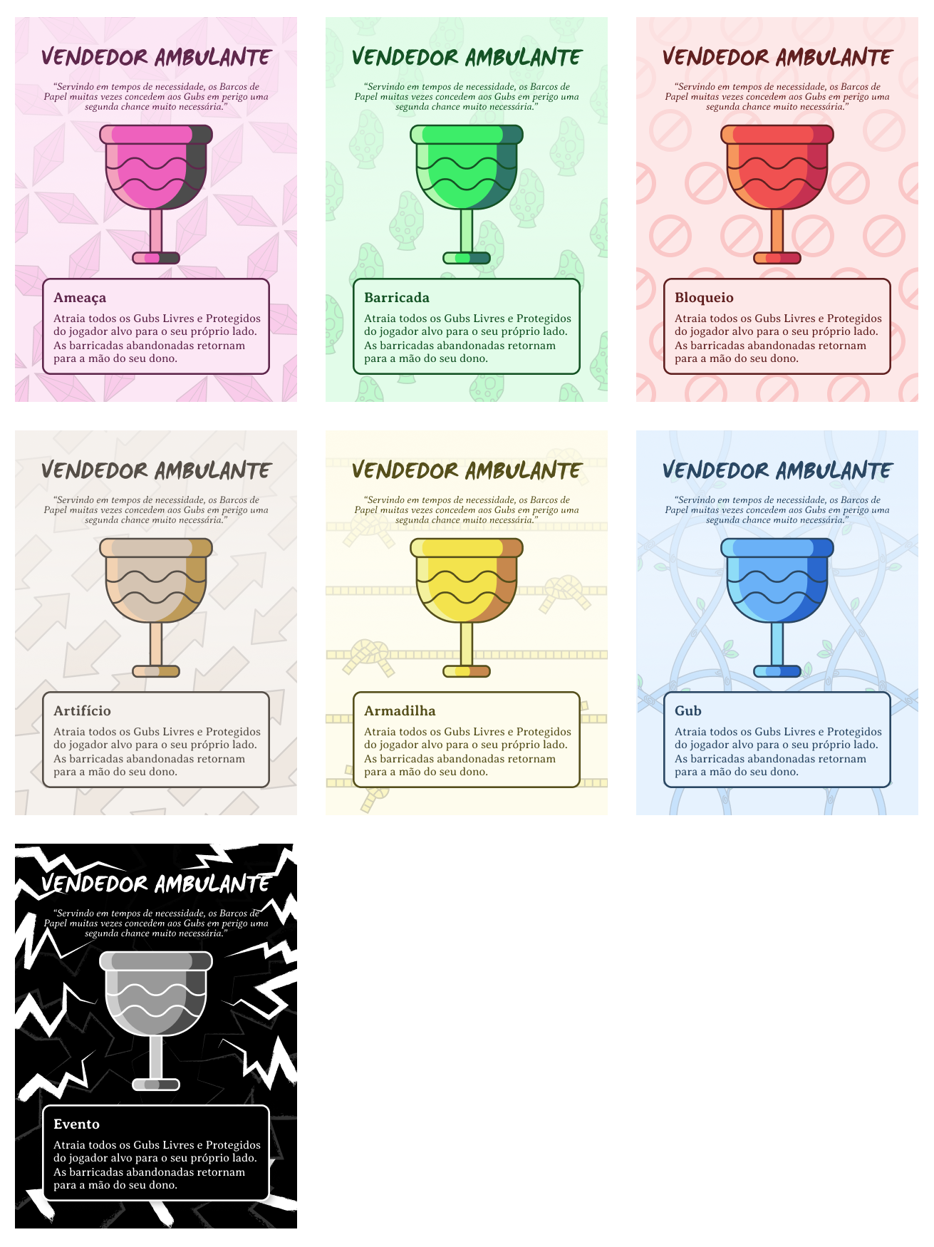
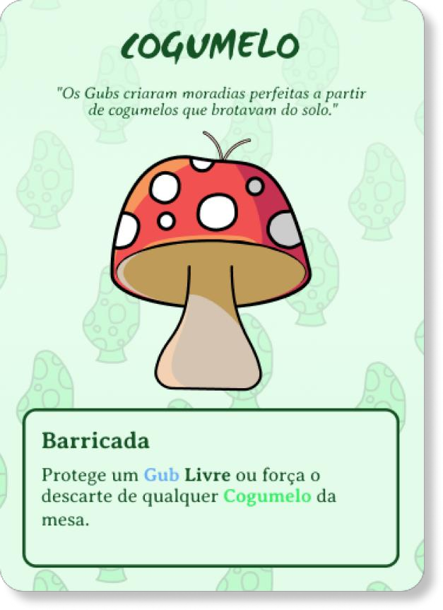
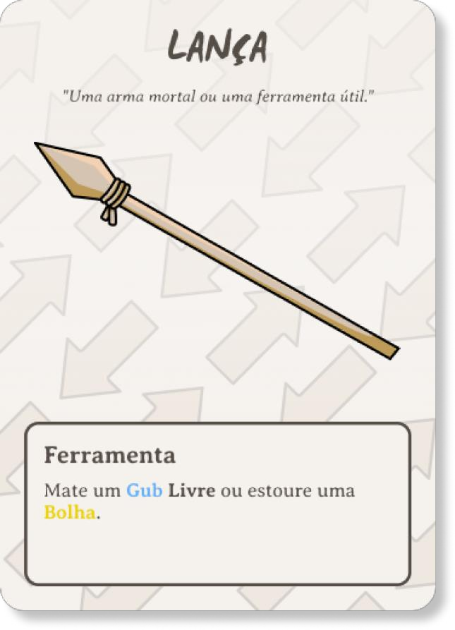
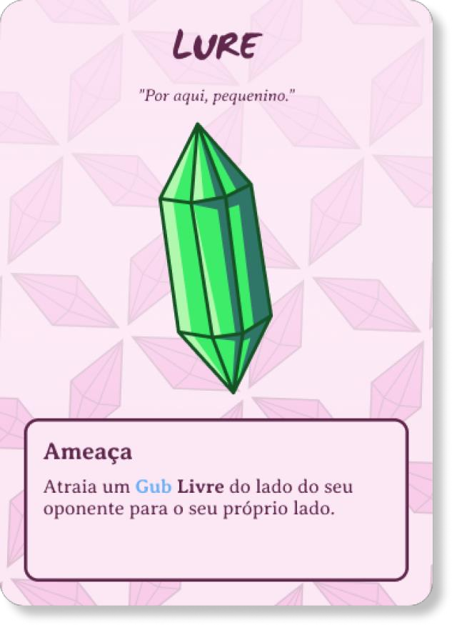
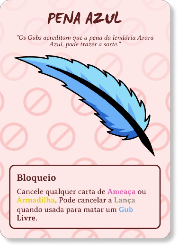
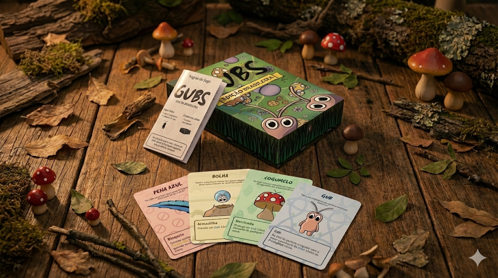
Final Illustrations for Each Card
Finalized art generating style guides.
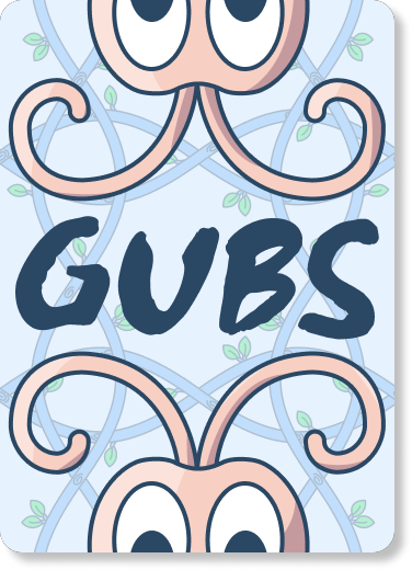
Card Back
Adaptation of visual symmetry and typography for the back of the card.
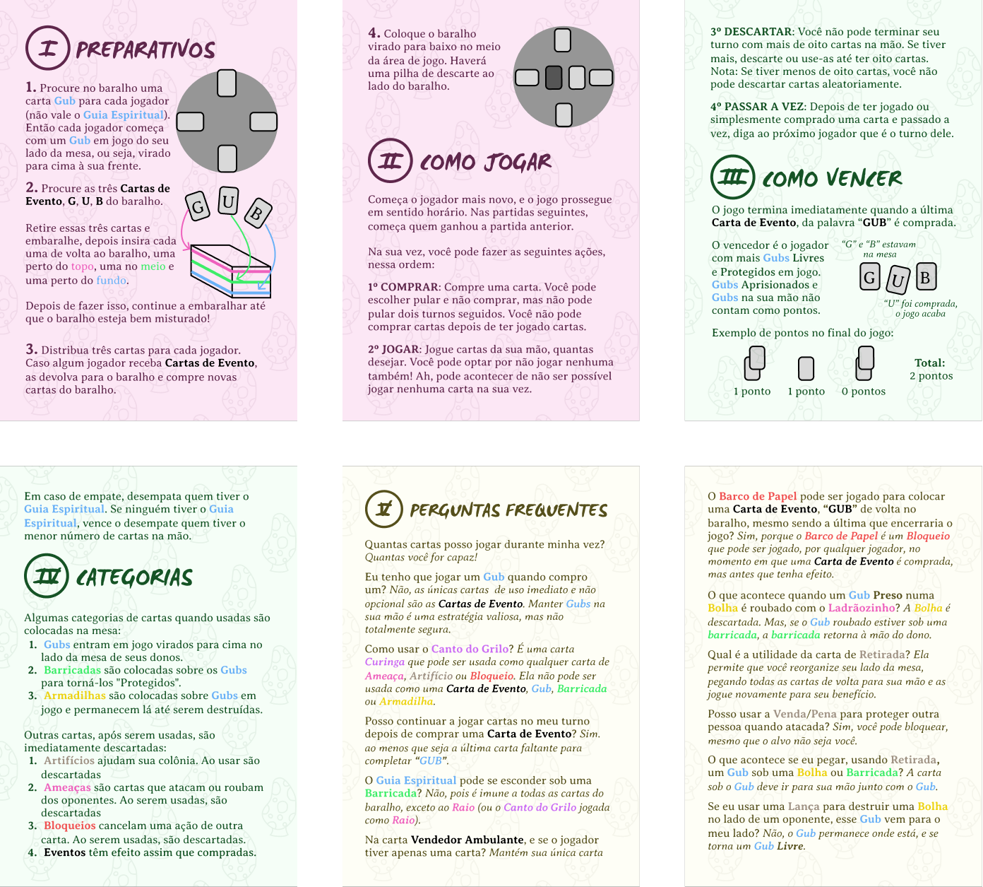
Game Deliverables (Manual)
Rules reformulated logically with an FAQ section.
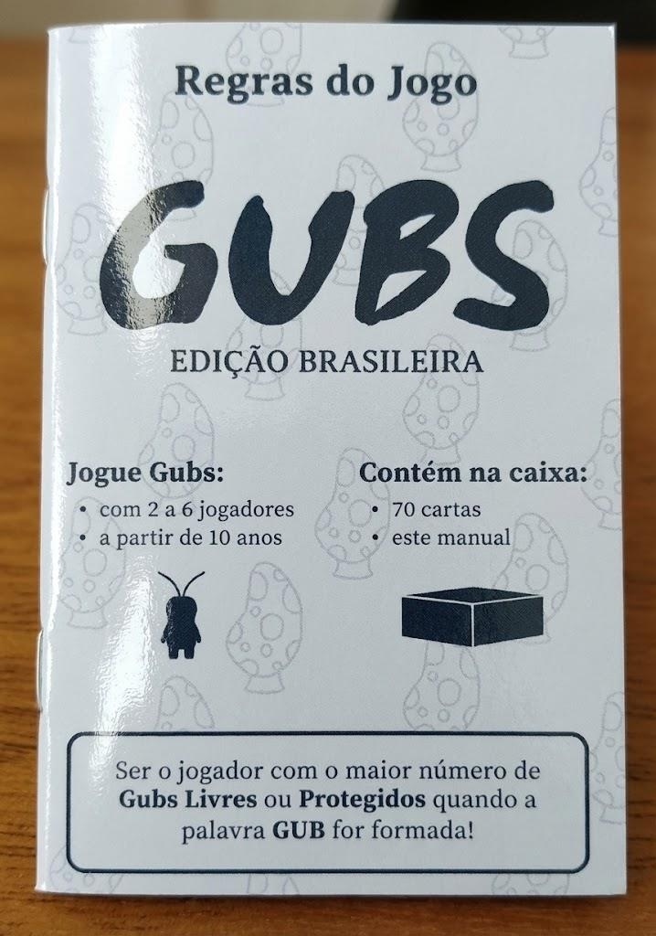
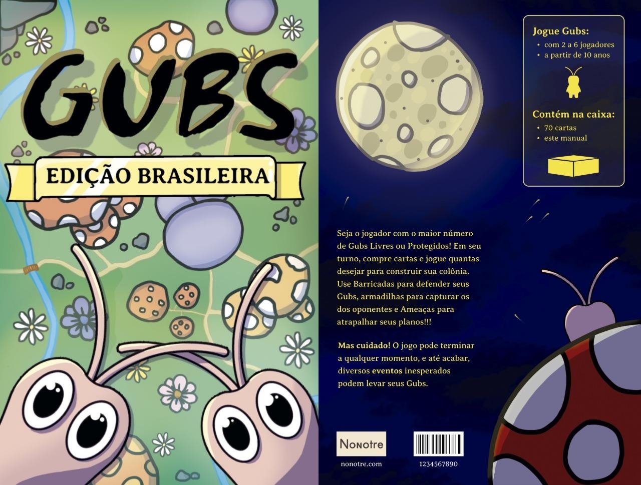
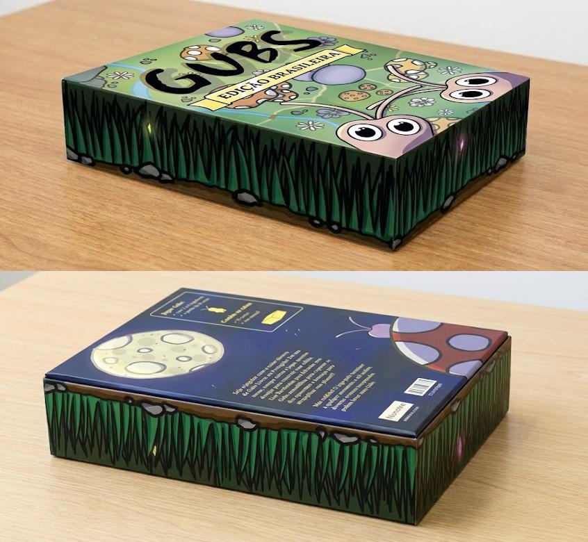
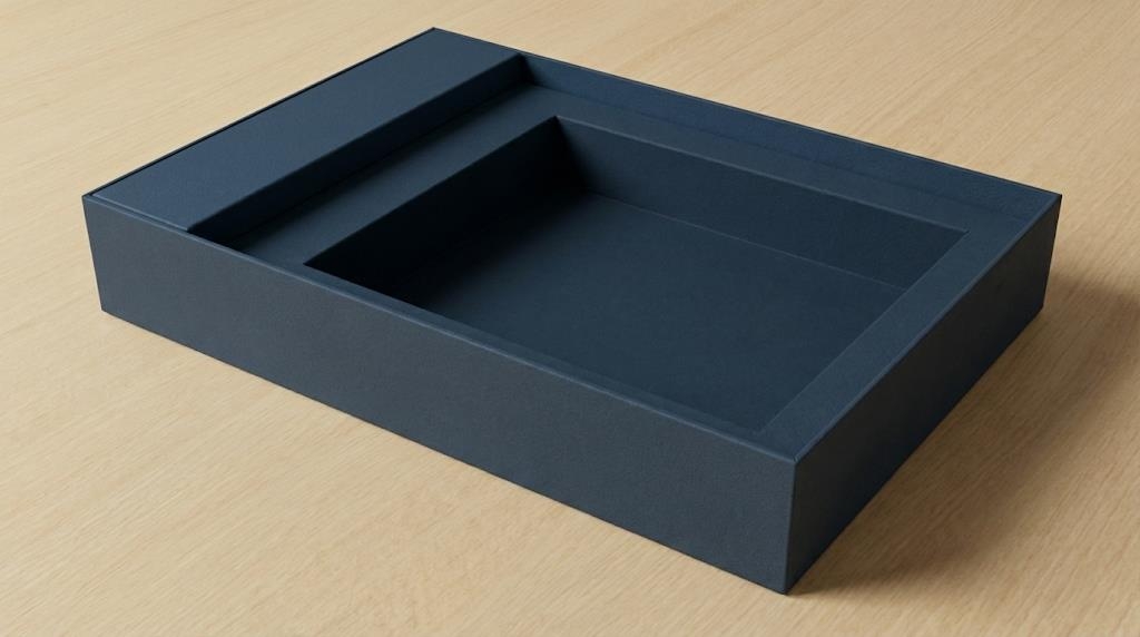
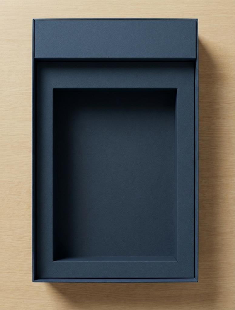
Game Packaging
Portable and compact sizing.
Next Steps and Market Viability
Future Roadmap
Production
Graphic production finalization for all 70 cards.
Testing
Validation and iteration testing with target players.
Strategy
Market potential analysis and licensing viability.
Moving forward, the project enters a critical phase where theoretical design meets physical production and real-world market dynamics.
Conclusion
Reaffirms the success of the Double Diamond methodology and highlights that the "localization" process was essential, surpassing literal translation to completely remove the linguistic entry barrier and generate cultural attachment.