Joanna x Interstate
Exploring Contrast & Anatomy of Typography
Typographic Context
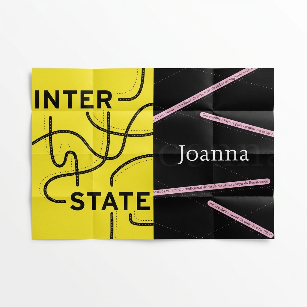
Both Joanna and Interstate are highly influential in the world of typography, but they were created in entirely different eras for entirely different purposes. One roots itself in humanist traditions, while the other was born from the industrial requirements of infrastructure.
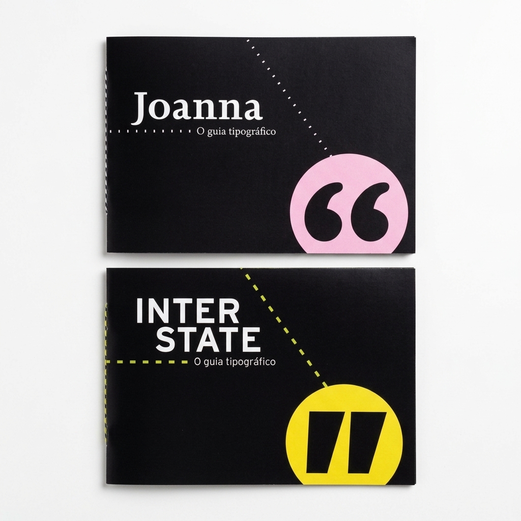
Joanna (Serif)
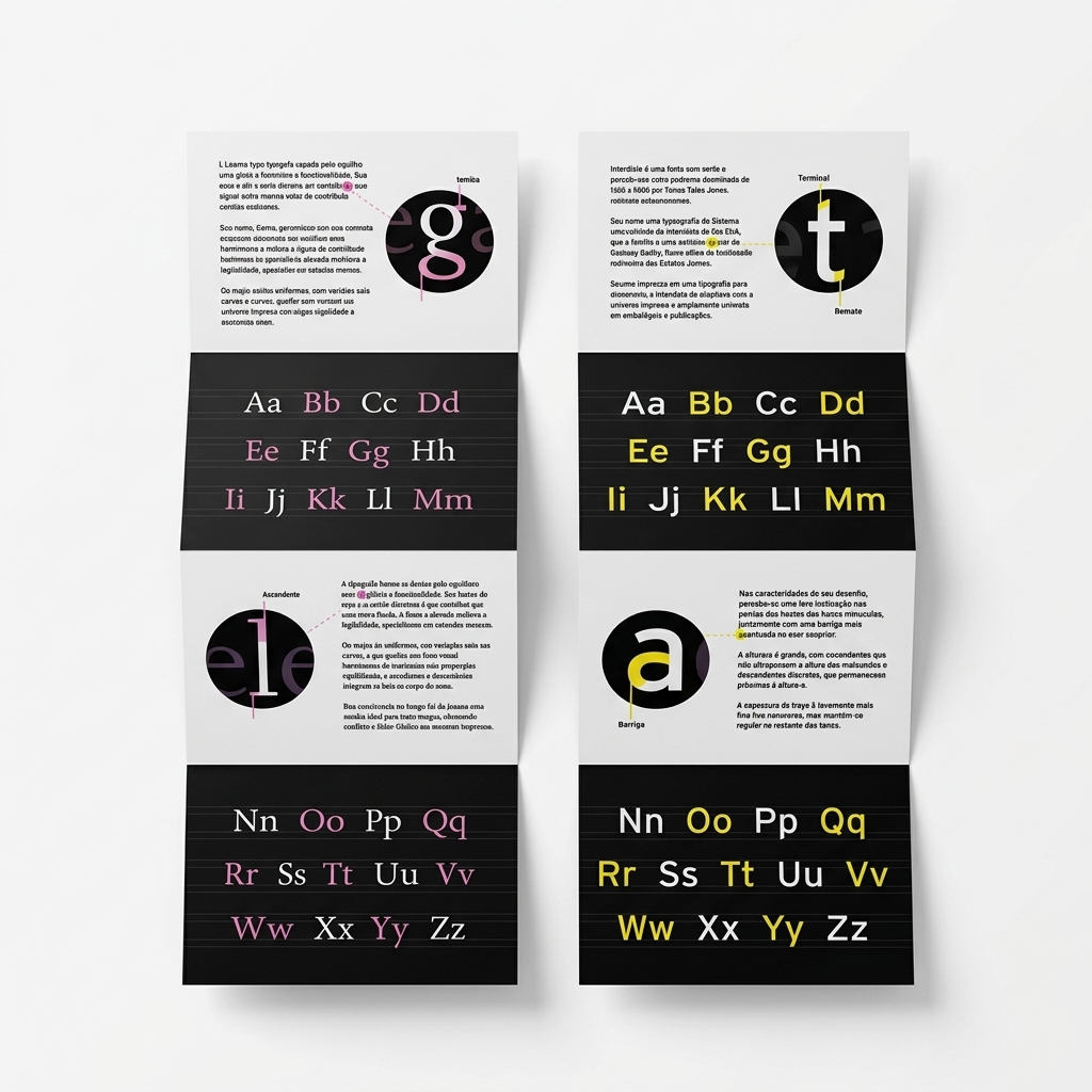
Designed by Eric Gill in 1930. A classic, elegant serif that bridges the gap between traditional book typography and the modern era. Features upright italics and sharp, unbracketed serifs.
Interstate (Sans-Serif)
Designed by Tobias Frere-Jones (1993–1995). Based on Highway Gothic used for US road signs. Optimized for extreme legibility at high speeds with tall x-height and angled terminals.
The Dynamic Contrast
Joanna offers immersive, long-form reading comfort, while Interstate provides high-impact clarity and an industrial, modern presence for branding and signage.
At a Glance: Comparison Table
| Feature | Joanna (Serif) | Interstate (Sans) |
|---|---|---|
| Era | 1930s (Early Modern) | 1990s (Digital/Signage) |
| Vibe | Elegant, literary, sharp | Assertive, industrial, modern |
| Roots | Renaissance printing | American highway signage |